Challenge
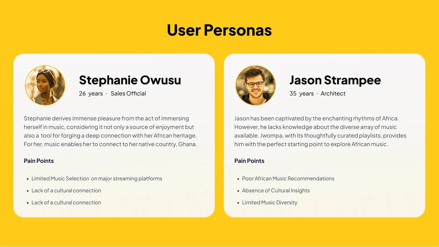
Jwompa (pronounced jom-pa), meaning "Good Music" in the Akan language, was established to solve a critical disconnect in the global music landscape: the lack of a modern gateway to the complete and unfiltered sound of Africa. Existing streaming giants often use a "cookie-cutter" approach that flattens the diversity of the continent’s 54 countries into generic categories. The challenge was to build a streaming service specifically for the diaspora and global music lovers that prioritizes authentic discovery and cultural depth over standard Western algorithmic patterns.
Strategy
The strategy was to move from the cookie-cutter, data-heavy layouts typical of Western platforms to create something that is uniquely curated for Africans and the African diaspor. I focused on "Cultural Continuity," ensuring the platform felt like a digital extension of Africa's vibrant music heritage rather than a transplanted foreign utility. By prioritizing community-led curation and storytelling over purely mathematical recommendations, the strategy positions Jwompa as a true cultural authority; a gateway where the music is presented with the context and "soul" it deserves.
Visual Identity
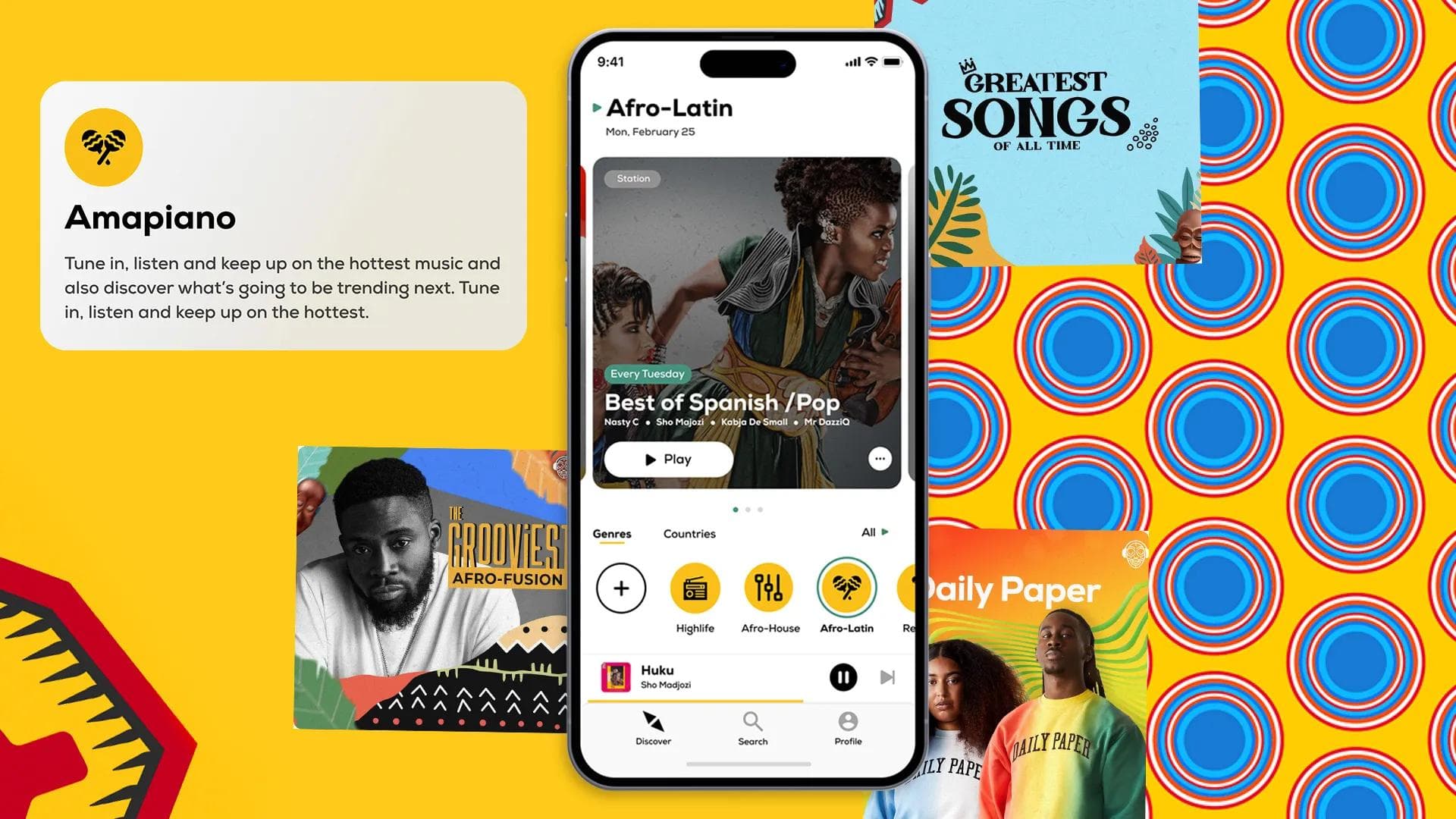
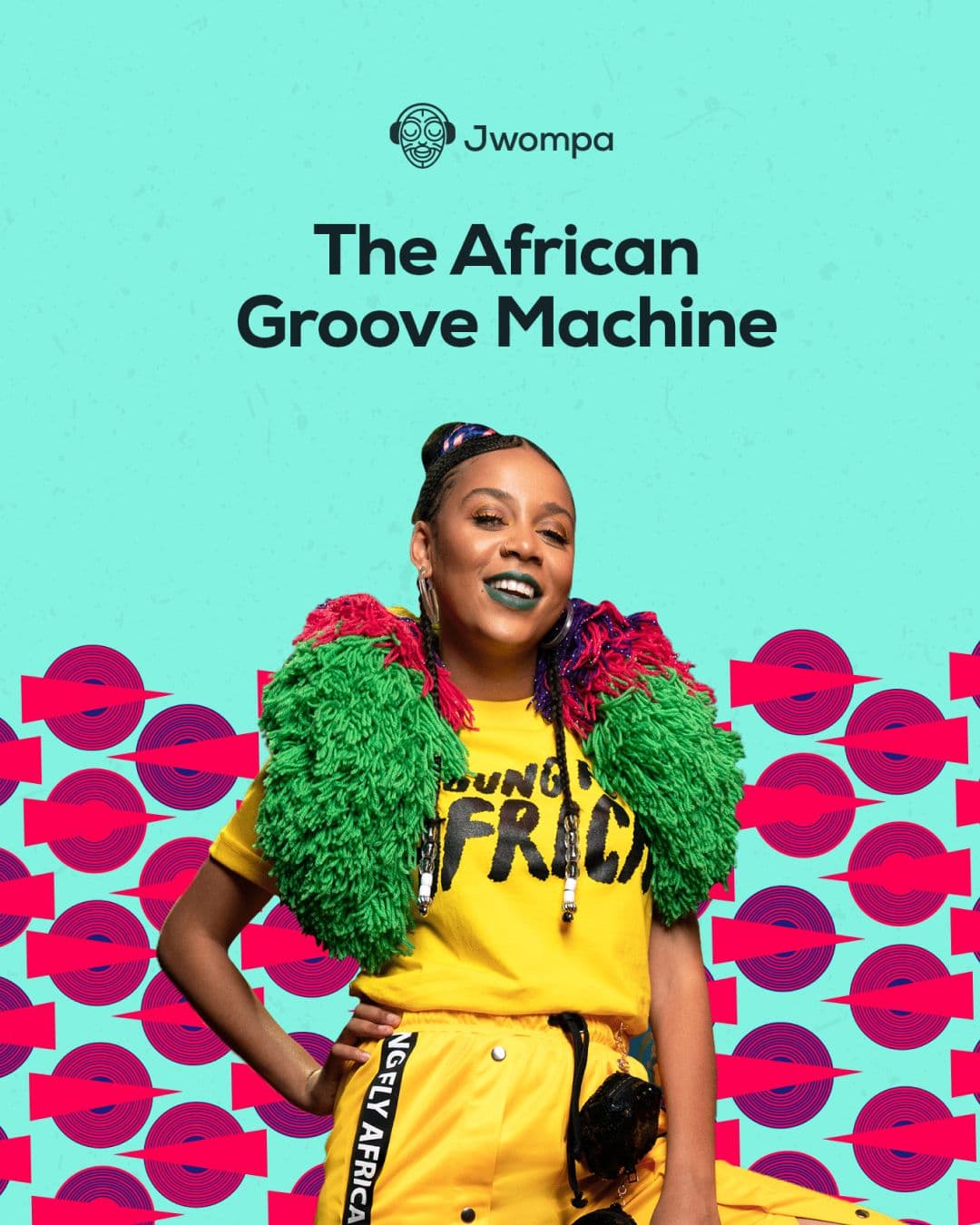
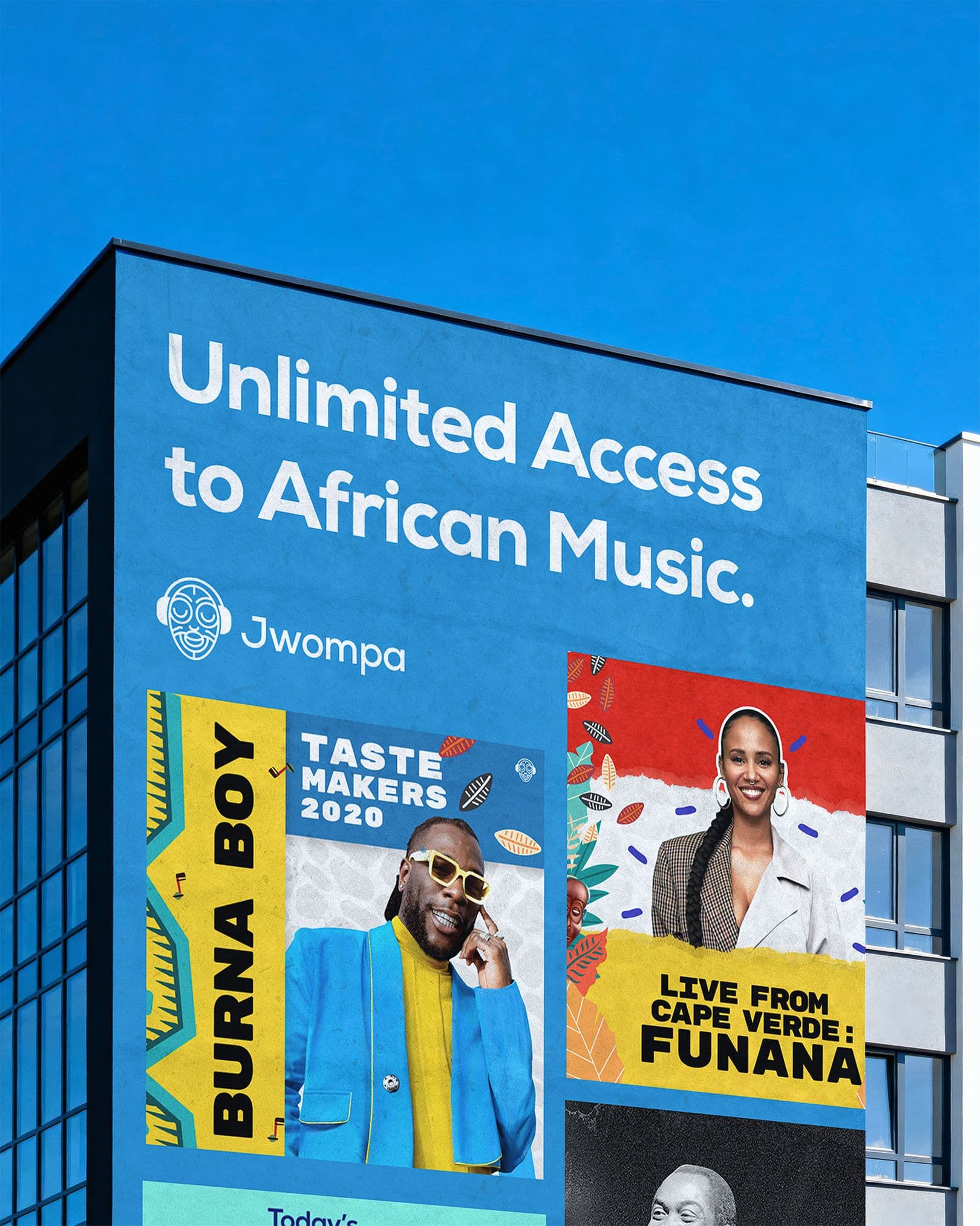
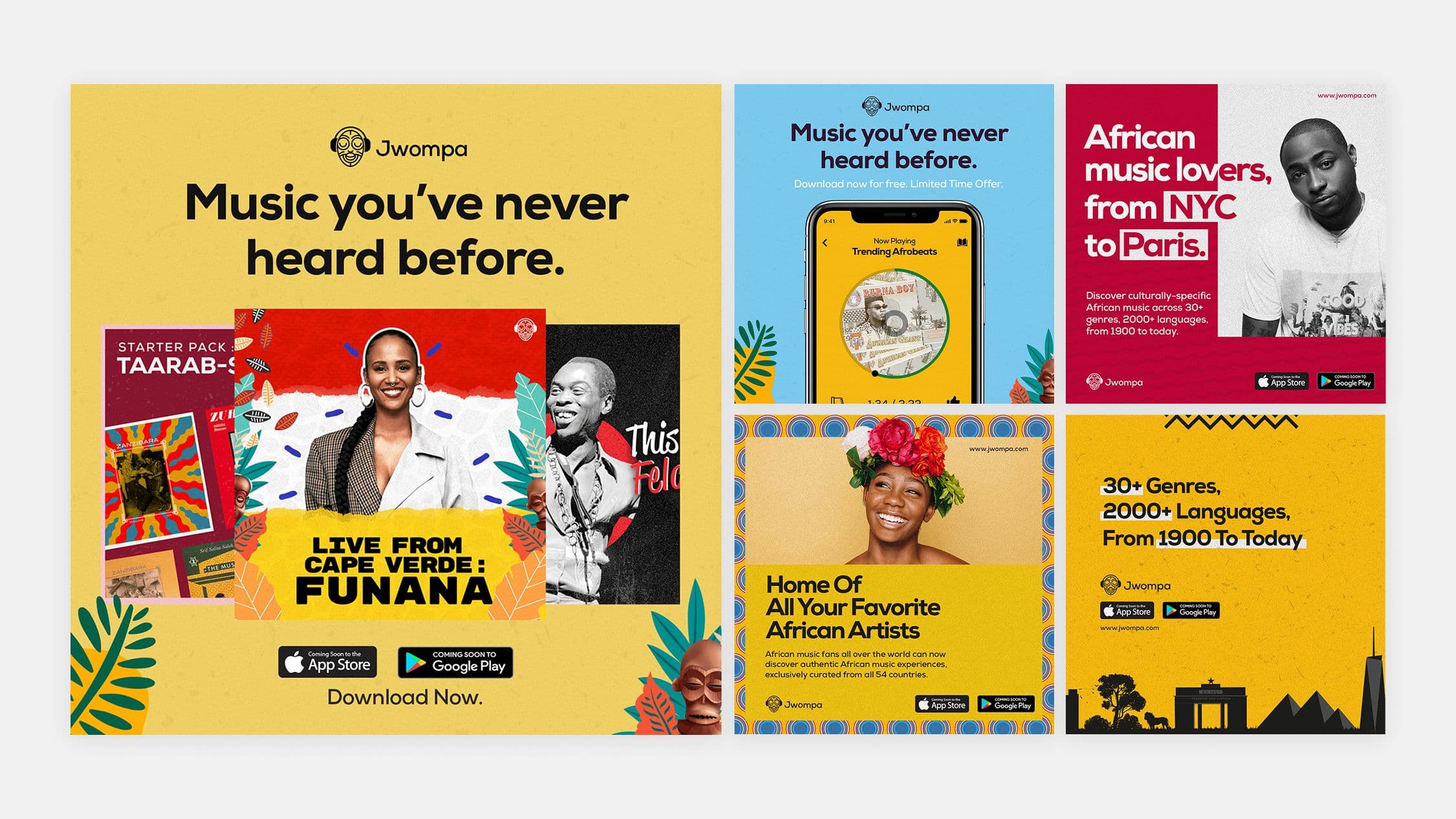
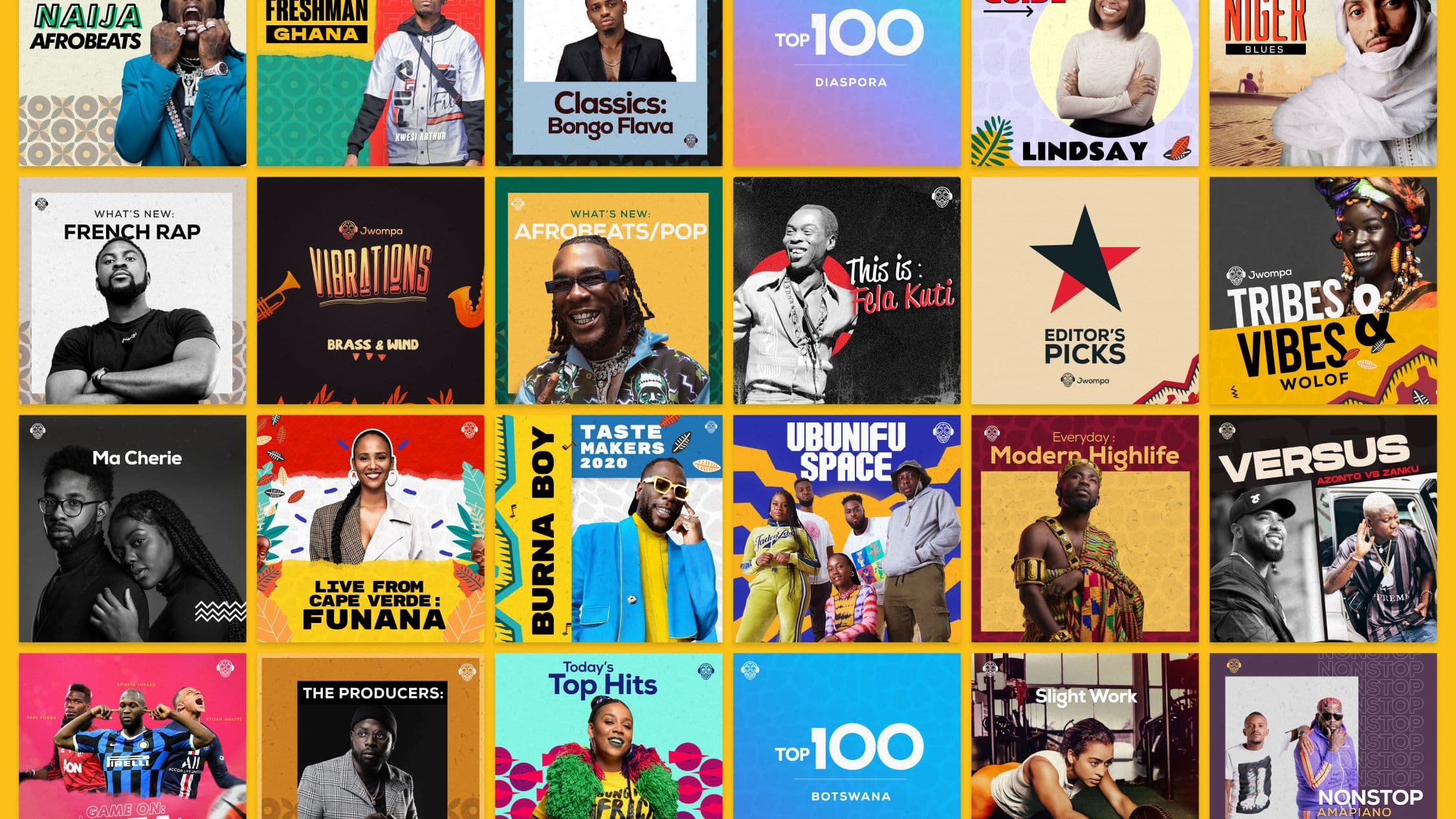
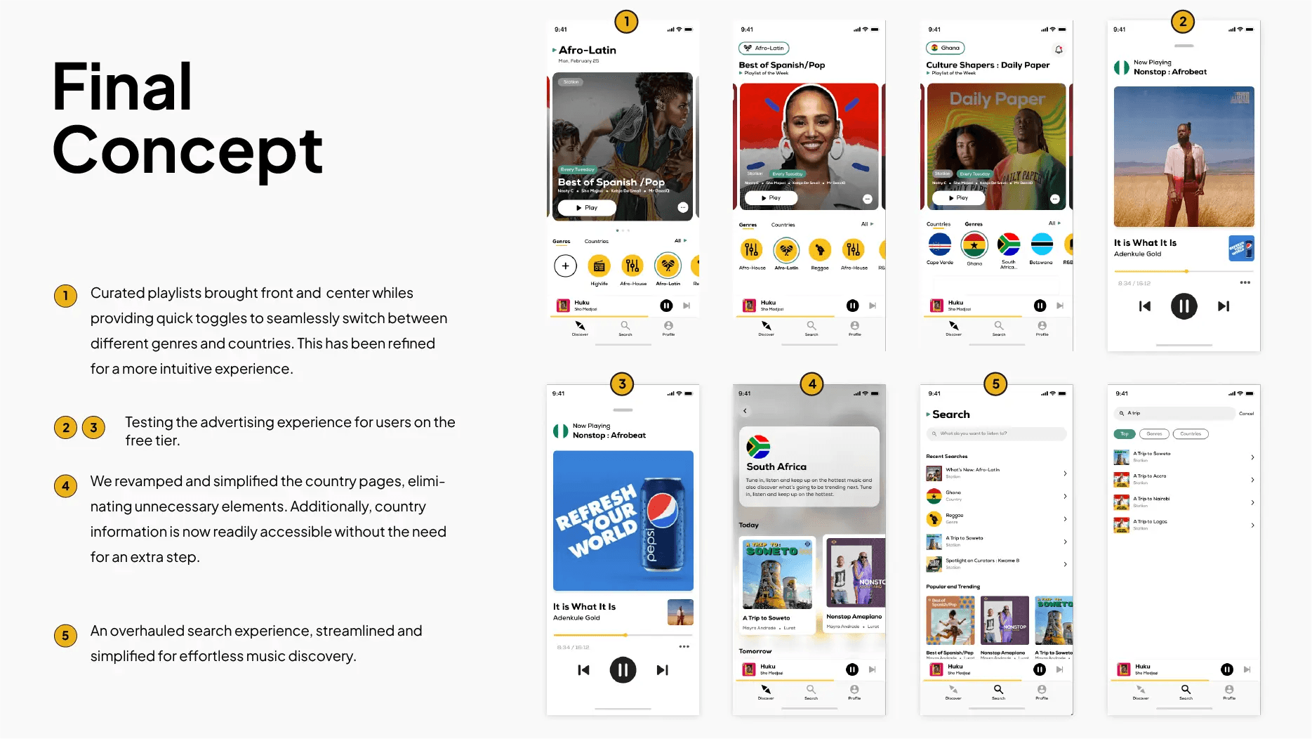
The visual identity is a vibrant rejection of the minimal, monochrome aesthetic common in the tech industry. I developed a bold, rhythm-inspired system that uses a rich color palette and dynamic typography to mirror the energy of the music. A major part of this work involved designing over 200 custom playlist covers and marketing materials that celebrate African aesthetics. This cohesive visual language ensures that from the initial ad to the "Now Playing" screen, the user is immersed in an environment that feels distinctly Afro-centric and premium.
UX Strategy
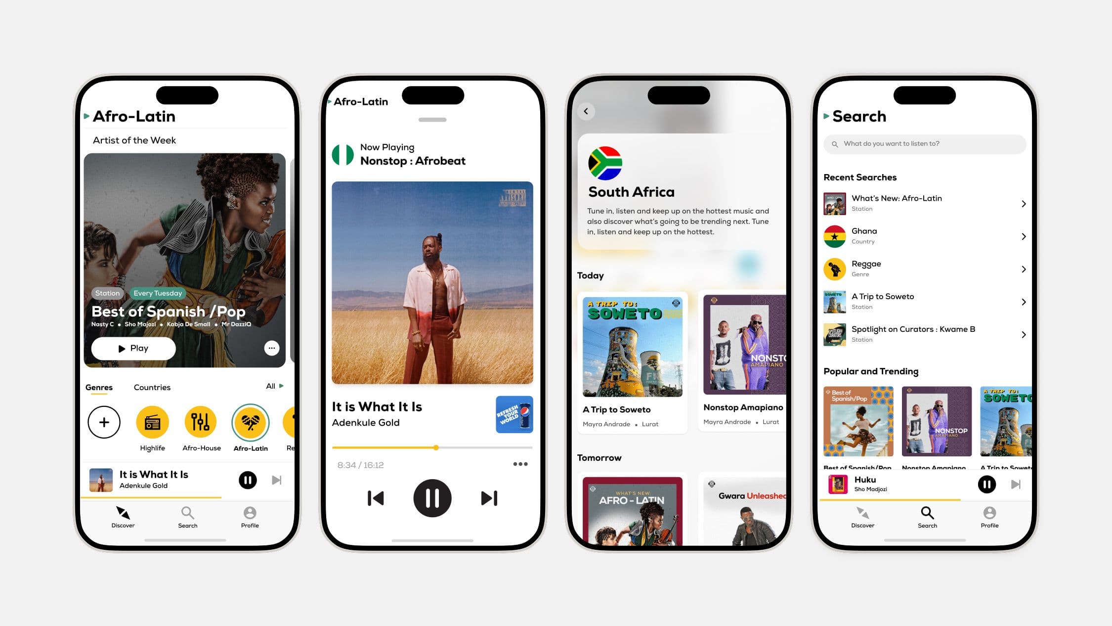
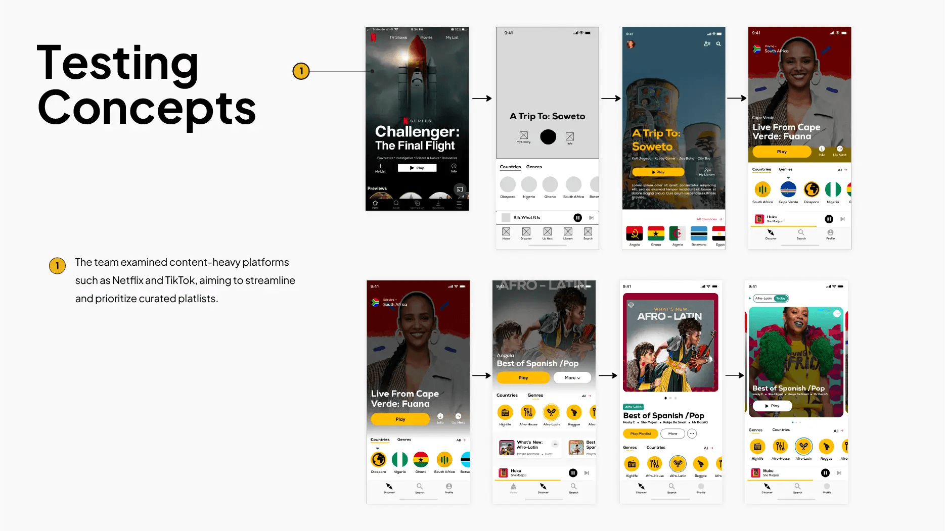
By studying the immersive engagement models of Netflix and TikTok, I implemented a discovery mechanism that favors high-fidelity curation and effortless navigation. The revamped interface features quick toggles to seamlessly switch between all 54 African countries and diverse genres, eliminating unnecessary layers to provide instant access to local sounds. This approach ensures that cultural discovery remains straightforward and intuitive, specifically serving diaspora listeners looking for a deep, frictionless connection to their heritage
Outcome
The evolution of Jwompa successfully established a professionalized hub for African music, bridging the gap between local artists and a global audience. By creating a platform that refuses to follow the "cookie-cutter" approach of the West, I delivered a product that resonates deeply with the diaspora and fosters a sustainable creative economy for all 54 African nations. This project proved that a specialized, culturally-empathetic design can dismantle market fragmentation and turn a streaming service into a powerful destination for cultural pride and connection.
